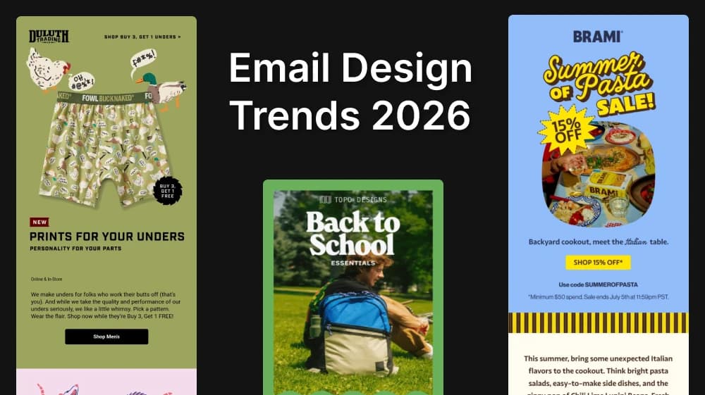
Email Design Trends 2026: what actually makes people read
Illustration, bold type, earth tones and rounded corners are shaping email design in 2026. Here's what each trend really solves and how to ship it well with AI
Email design is a subset of information design, which means every email has a single job to get right: being understood.
So the honest test for any email you ship is simple: did the reader understand it? Could they understand it under the conditions they were actually in when it arrived?
"Accessibility" is just the recognition that people take in information differently. Some of those differences are permanent disabilities, but many are situational: someone reading on a train with the volume off, someone scrolling one-handed with a coffee in the other, or half-watching a meeting. Design has to survive the noisy train.
So an effective e-mail in 2026 is comprehensible, accessible, and leads to a clear action.
Trend 1: Illustration is back
Illustration is having a moment, and the reason is mechanical rather than aesthetic. An illustration grabs the eye immediately and creates a natural focal point, it tells the reader where to start.
This is called visual hierarchy: arranging elements so readers know what matters first, second, and third without having to work it out. Get hierarchy right and you can ship a beautiful email with no illustration at all, get it wrong and the illustration is just an expensive distraction.
The rules that hold up:
- Your H1 is the primary focus, and it should be consistently the largest element in the email. The moment your headline competes with something else for size, the reader has to decide what to read first, and deciding is friction, so they just leave.
- Contrasting colors create visual friction: use that deliberately, and mostly for CTAs. Friction is a tool, spend it on the one thing you want clicked (and make sure the contrast is accessible while you're at it).
- Size relationships between H1, H2, H3 and body copy should stay consistent throughout. You need to mantain a design system.
- Semantic HTML signals importance to machines as well as humans. Real heading tags tell screen readers what the structure is, and increasingly, they tell AI summarizers the same thing. If a model is going to compress your email into two lines inside someone's inbox assistant, you want it reading a properly marked-up headline rather than guessing from a
<div>.
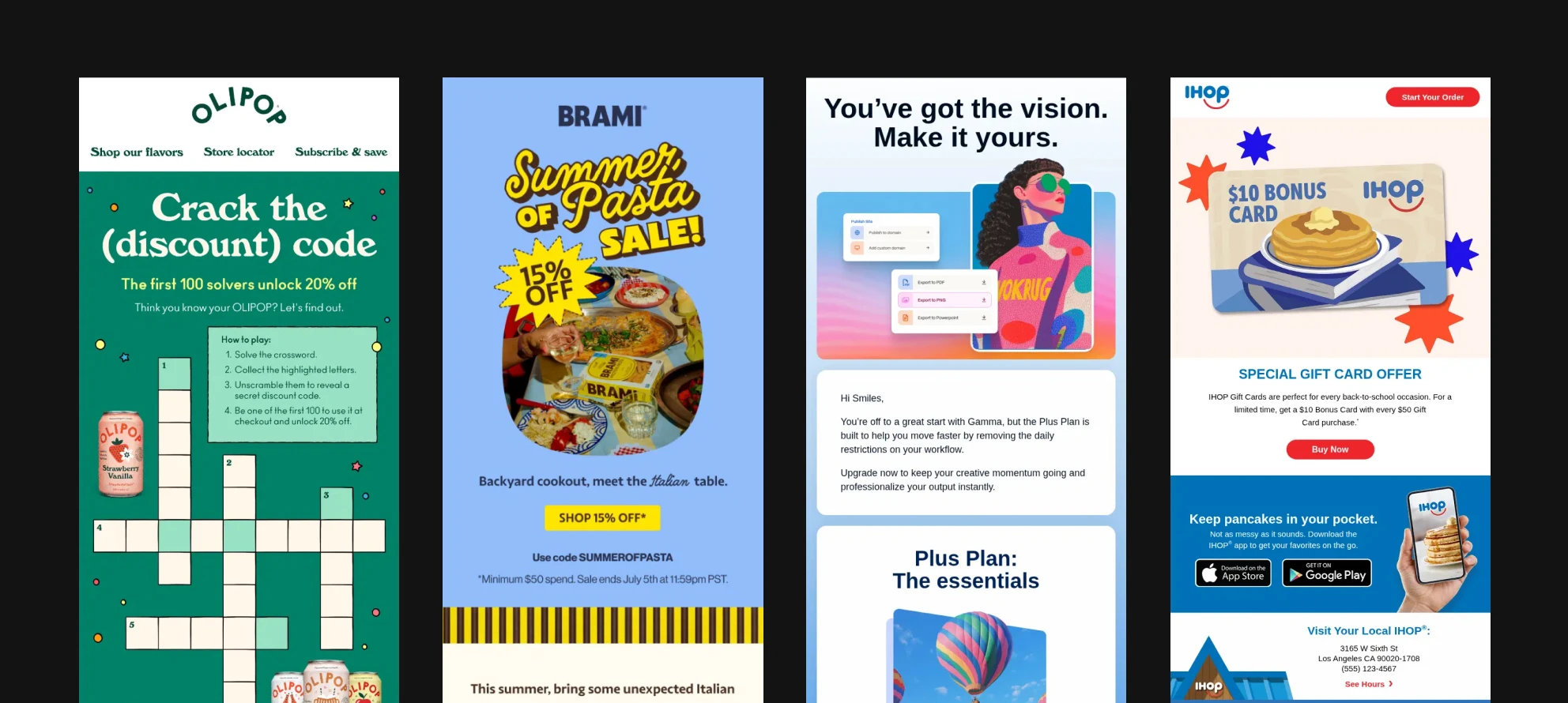
Illustration, then, is a value add. Which brings up the least glamorous and most-skipped detail in the entire discipline: alt text. Images fail to load constantly, blocked by default in plenty of clients, slow on bad connections, stripped in plain-text fallbacks. When yours doesn't load, alt text is your email. Write it like it matters, because for some readers it is the only version they get.
If you're producing illustrations for campaigns, this is where generation earns its keep. Create Image handles the illustration itself. For alt text at volume, Image to Text will describe an image in detail — a genuinely fast way to draft alt copy for a whole campaign instead of leaving the field empty.
Staying on brand across forty sends a year
Email is the highest-frequency surface a brand has (weekly newsletters, drip sequences, launches, transactional receipts, win-backs). The problem isn't making one illustration, it is making a year of them that still feel like they came from the same brand.
The fix is treating your visual language as a stored. In Artificial Studio these are References: reusable reference-image sets you can apply to generate images with AI.
- Styles hold an aesthetic.
- Characters hold a person's likeness.
- Objects hold a specific product.
You build them once, they live in your workspace, and you apply them to anything you generate afterwards. Or you can just upload a single reference image and the AI will work from that
For a creative agency or a freelancer, it is great. You onboard a new account, you build their style, recurring characters, and hero products as References once. From that point on anyone on the team can produce in that brand.
Style transfer does the same job in the other direction when you already have an asset that needs to match a reference.
Trend 2: Bold typography
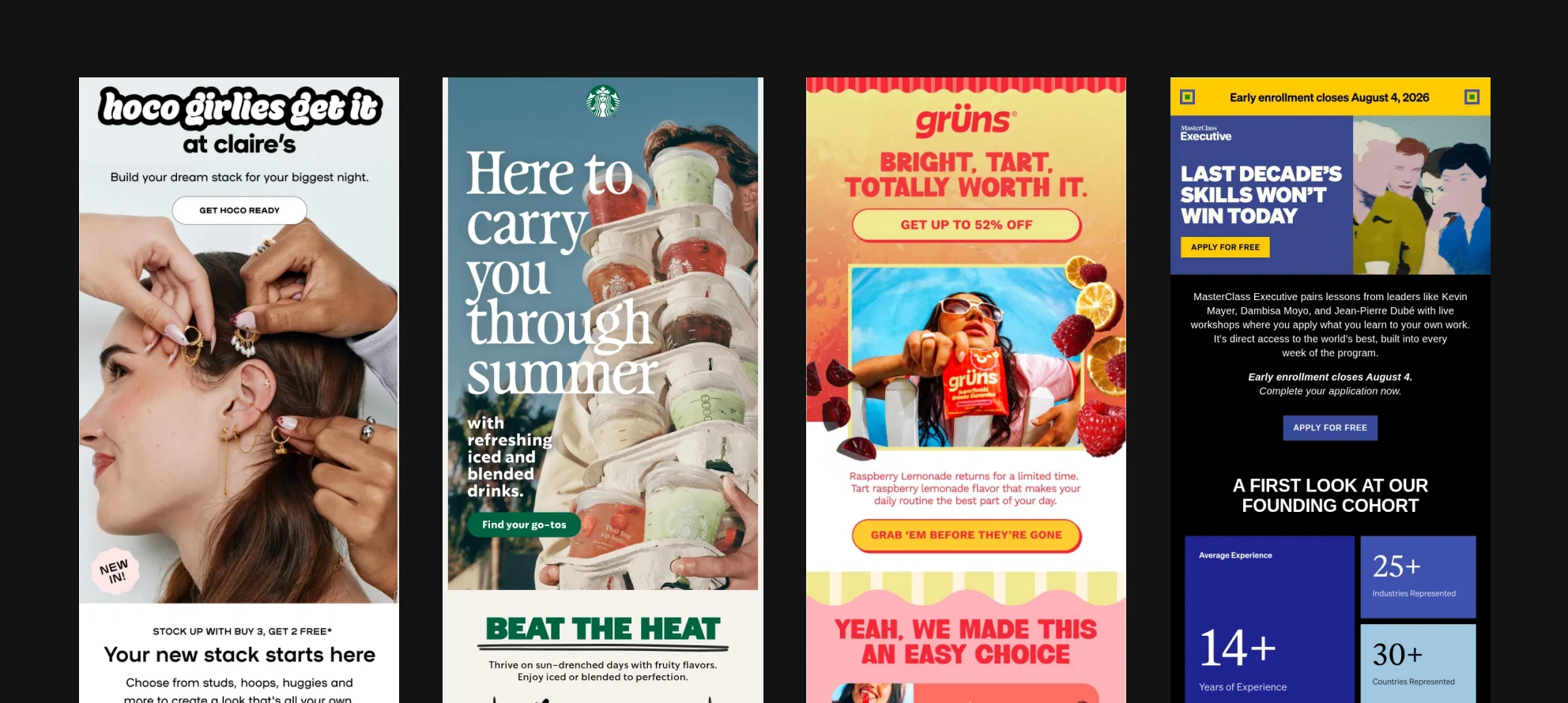
Oversized, heavy type is doing the same work as illustration: instant meaning, immediate focal point, no decoding required. And the specific expression showing up right now is live text set over a background image.
Live text over an image is way better than text inside an image, even better from mobile. Live text scales with the reader's settings, gets read aloud by screen readers and can change with dark mode.
The scannability rules:
- 16px minimum for body copy. 18px is better.
- Headlines noticeably larger than body copy — if you have to squint to tell which is which, it doesn't count.
- Break copy into small chunks. Walls of text get skipped.
- Add negative space around text (white space).
- Left-align anything longer than two lines. Centered text is measurably harder to parse for dyslexic readers, because every line starts in a different place and the eye has to hunt for it.
Two tests you can make:
The blur test. Squint at your email, or step back from the screen. Is the key information still readable? If the whole thing dissolves into an even grey texture, you have no hierarchy.
The glance test. Look at it, look away, then count how many facts you actually retained. If the answer is zero, the design failed regardless of how good it looks at 100% zoom.
If you're building background images for live text, you'll usually need the same visual in several crops: desktop hero, mobile, maybe a dark variant. Extend Image reframes an existing asset into different aspect ratios instead of forcing you to regenerate and lose the match.
Subscribe to get deep dives on tech and the future of creative work.
Choice reduction
Every additional CTA is additional cognitive load, and overwhelmed readers don't pick the wrong option, they do nothing.
Try this on your next campaign: strip the email down to one core action. Then add context back selectively, and only where it earns its place. Most emails end up better than they started, and the ones that don't tell you something useful about what you were actually trying to say.
By the way, repeating that single CTA is fine, it isn't a second choice. A button near the top catches quick deciders, the same button at the bottom catches people who needed to read the whole thing first.
It's not an unbreakable rule either, some formats legitimately need more. Newsletters and recipe emails are browsing experiences by nature, and stripping them to one link would break them. Test to find your audience's ceiling rather than importing someone else's rule.
The way to think about it is the difference between a Cheesecake Factory menu and a tasting menu at a good restaurant in Barcelona. One hands you a spiral-bound binder and makes the decision your problem, and the other has already made it for you, and you enjoy the meal more. Overstimulation lower click rate and it's a direct line to the unsubscribe button
Trend 3: Earth tones, softness, and sounding like a person
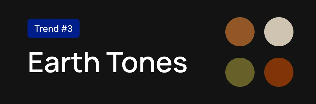
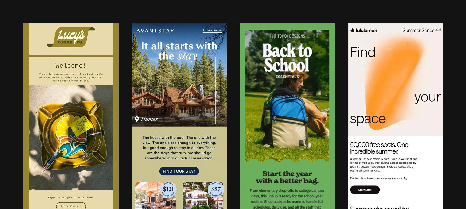
Muted and natural palettes are everywhere right now, and it's not an accident (mossy greens, warm neutrals, sand and clay). It's biophilic design: replicating natural environments inside constructed ones. After a decade of saturated tech blues and high-contrast gradients, a calm palette reads as human and trustworthy.
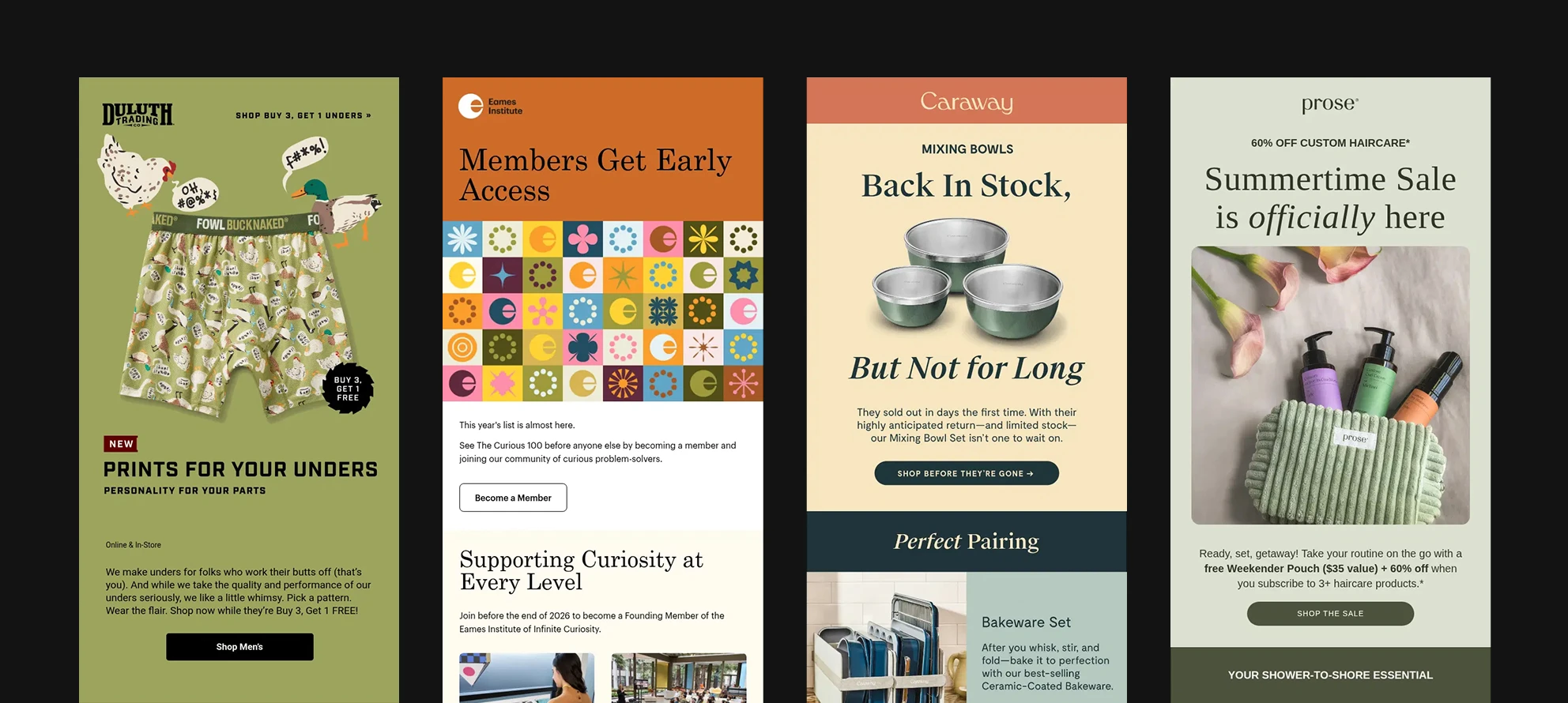
Softness shows up in three places:
- Shape. Curved and rounded forms feel safer than sharp angles. More on that below.
- Color. If a full palette redesign isn't on the table, you can get most of the way there with muted versions of your existing brand colors, or the same colors at lower opacity. Color Palette will recolor an existing asset to a palette you choose, which is a fast way to bring a library of hard-edged brand imagery into a softer range without recreating any of it. If you're building a visual identity from scratch, Brand Kit creates the logo, colors, typography and mockups from a single brief.
- Language. Warm, playful, a little vulnerable. If your color is locked by brand guidelines, softness can be expressed through copy alone. Tone is free and nobody has to approve a hex code.
The highest-leverage version of this in B2B costs nothing to implement: send from a named person with a photo, not a no-reply address. A real sender name and a real face changes how the whole email is received before a single word is read.
Trend 4: Rounded corners and the space they create
Rounded corners are the most visible softness signal going because humans associate sharp edges with danger.
Two caveats worth holding:
- The trend is close to peak saturation, so if everything in your email is a pill shape you've stopped signaling anything. It's worth exploring the other expressions of softness above rather than riding this one alone.
- Rounded corners push content toward the center, which naturally creates negative space. This trend is also doing hierarchy work.
Newer versions of Outlook handle border-radius fine. Older ones need VML (vector markup language) to render rounded shapes at all. Some builders, RG Studio and BeFree SDK among them, include the VML for you. If you're hand-coding, you'll be writing it yourself.
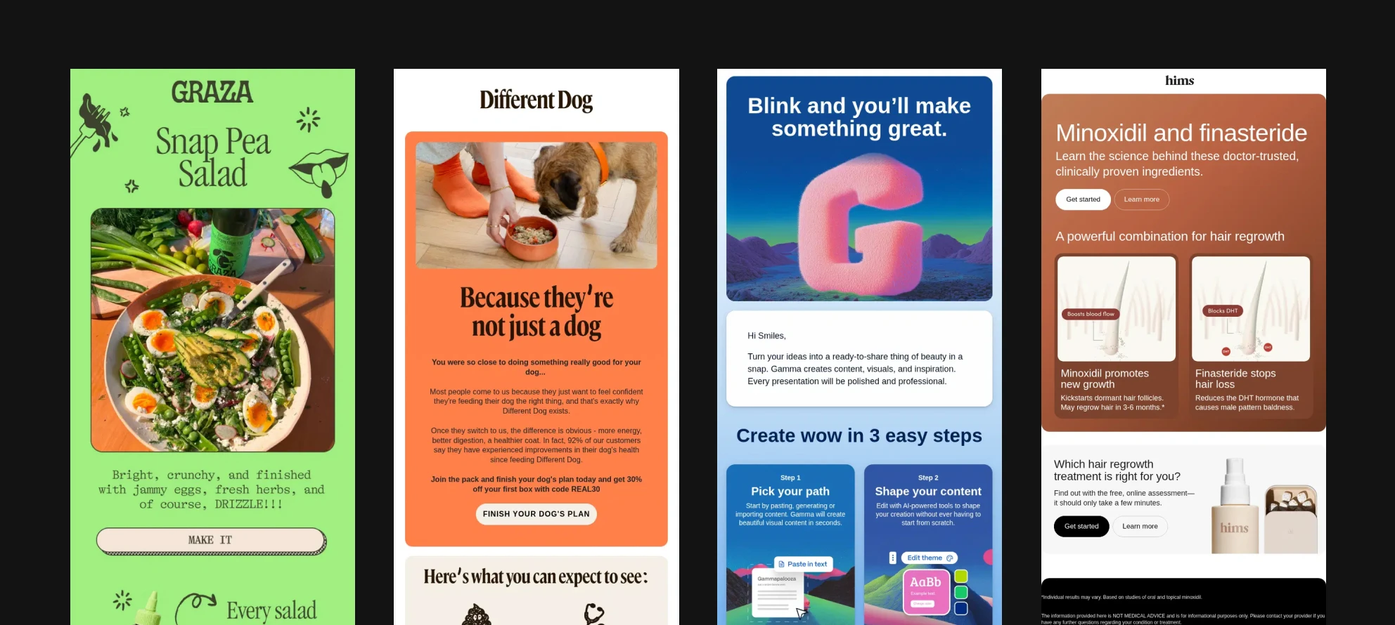
While you're in the spacing mindset: line height of 1.5 minimum. Same logic as the 16-18px font floor. It costs you vertical space and buys you readability, and that trade is almost always worth making. If you want to be precise about it, golden-ratio typography calculators will take your font size, content width and typeface and hand you an ideal line height.
Two production notes for this section. Crop and expand lets you add canvas around a subject, which is how you get real breathing room inside an asset rather than faking it with padding around a tightly-cropped image. And Remove Background lets you place a subject directly on a brand color instead of inside a hard-edged photographic box — often the single fastest way to make an email feel softer.
Some questions you may have
Does image-to-text ratio still affect deliverability?
No. That stopped being a spam filter signal more than a decade ago. Deliverability today is driven by sender reputation, engagement, and honoring unsubscribes, do those three things and the ratio is irrelevant to the filter.
The engagement effect is real though, which is a different argument for the same behavior. A balanced ratio is more accessible, and it's far friendlier to the AI summaries increasingly sitting between your email and your reader. A model can summarize your text. It can't summarize your JPEG.
How much should I optimize for dark mode?
It matters, and the share of readers in dark mode climbs every year. It's also not worth breaking yourself in two over.
The practical steps: add an outline or outer glow to logos so they survive on a dark background, avoid pure black and pure white hex values, and choose midtones that invert cleanly. Then accept that Apple Mail gives you essentially no control, and move on. Pixel-perfect rendering across every client is a myth, and a certain release of control is part of the job.
Do transactional emails need any of this?
They need it most, and they get it least. Receipts, shipping confirmations and password resets have open rates the marketing team would trade a quarter for — and they're usually the ugliest thing a brand sends. Bold typography, warmth and brand personality all apply. For e-commerce, a confirmation email is a chance to show the product properly rather than as a 60px thumbnail.
Building the visual layer for your campaigns? Artificial Studio gives creative teams 60+ AI tools for image, video, audio and 3D in one place — with References so everything you generate stays on brand across every send. Explore the tools.
Try it yourself
Start creating with the tools mentioned in this article.