A designer's guide to Composition in the age of AI
AI made perfect assets free for everyone. This designer's field guide to composition: hierarchy, grids, whitespace, is the advantage AI can't automate.
You can design with the best assets in the world, the perfect typeface, colors and images with AI — and if the composition is wrong, the design is wrong. No amount of polish on the individual pieces saves a layout where the pieces are in the wrong place.
AI made perfect assets nearly free for everyone. Your competitor or the founder with no design training, they all can generate the same images, videos and audio. So good images stopped being a differentiator.
Composition is now the most important skill: The ability to arrange 📐. Is simply how you organize elements within a space. What goes in, where it goes, how big, how small. If you want to know more this guide is for you:
1. Visual hierarchy — design the path the eye takes 👁️ 👁️
People don't read a layout evenly. The eye follows a route: it lands somewhere first, then second, then last. Your job is to design that route: headline, subhead, image, body, call to action.
If everything carries the same visual weight, the eye doesn't know where to start, so it gives up and leaves.
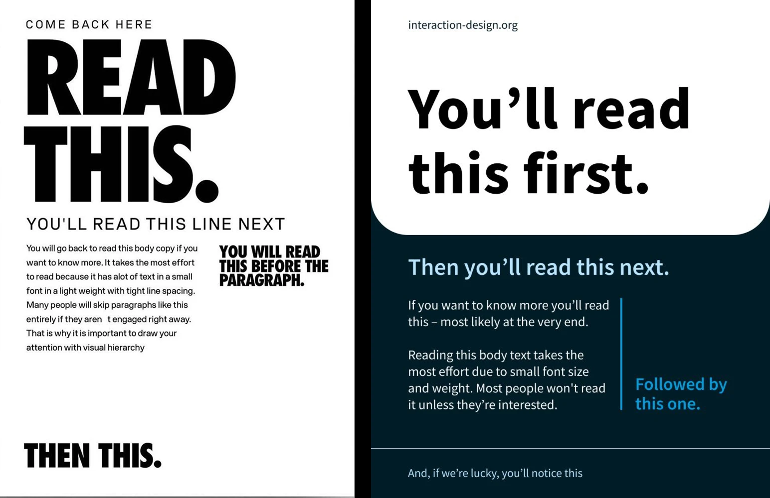
You build hierarchy with:
- Size
- Type weight
- Color
- Contrast
💡 A tip to know if the purpose of a website is clear is to do “The Squint Test”: Slowly close your eyes to intentionally blur your vision to help you see what stands out ↓
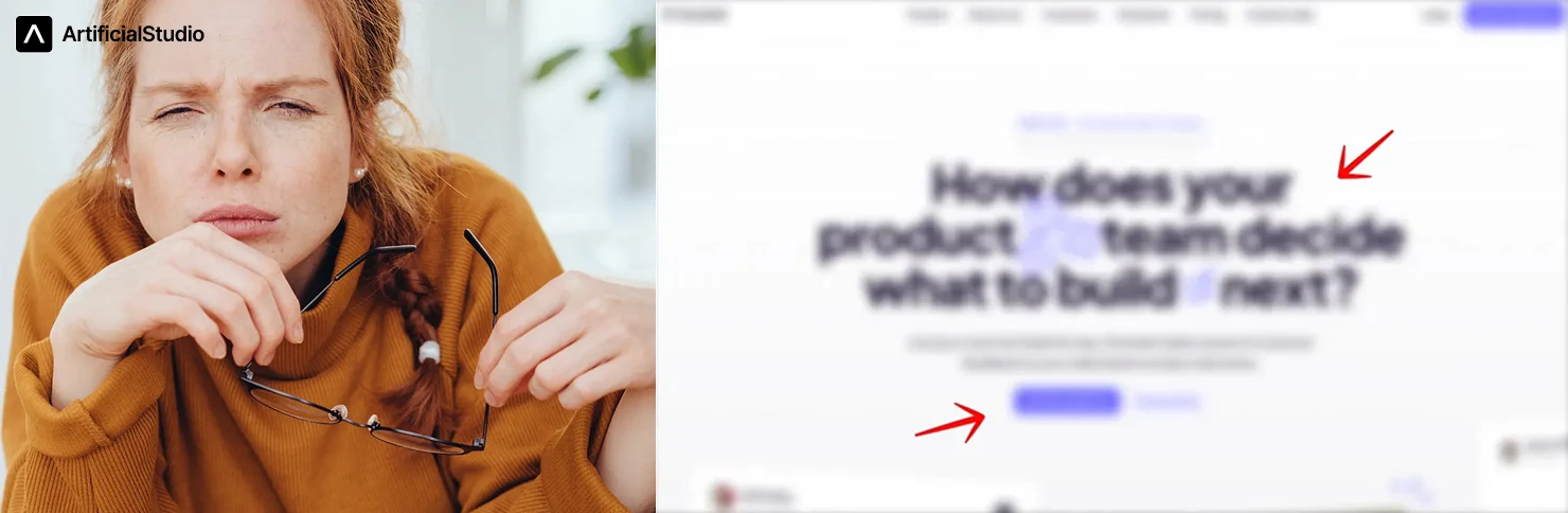
Hierarchy is not synonymous of size: just because a title is primary doesn’t mean it has to be gigantic; you can also play with weight or color. Generally, a dark color is used as primary, a lighter color for secondary content, and perhaps a very light gray for tertiary content.
2. Grids — the invisible skeleton ▦
Grids are one of the most powerful tools in composition. A grid is the invisible skeleton that holds everything together: columns, margins, gutters. You never see it in the final piece, but you feel it when it's missing. That vague "something's off, I don't know why" is very often just a missing grid: elements floating, almost aligned but not quite.
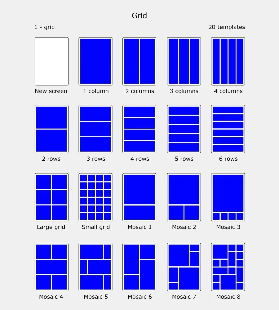
You don't need an elaborate system. Set some margins and four even columns and you're already ahead of most people. It's not just for editorial layouts, either — it's what makes a set of Instagram posts feel like a set instead of a pile.
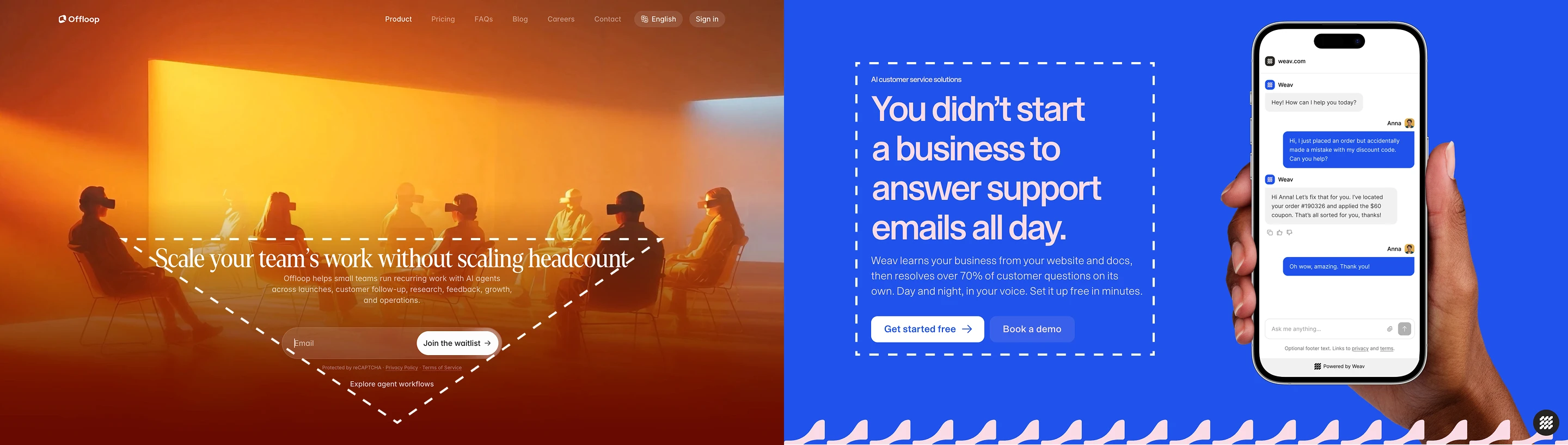
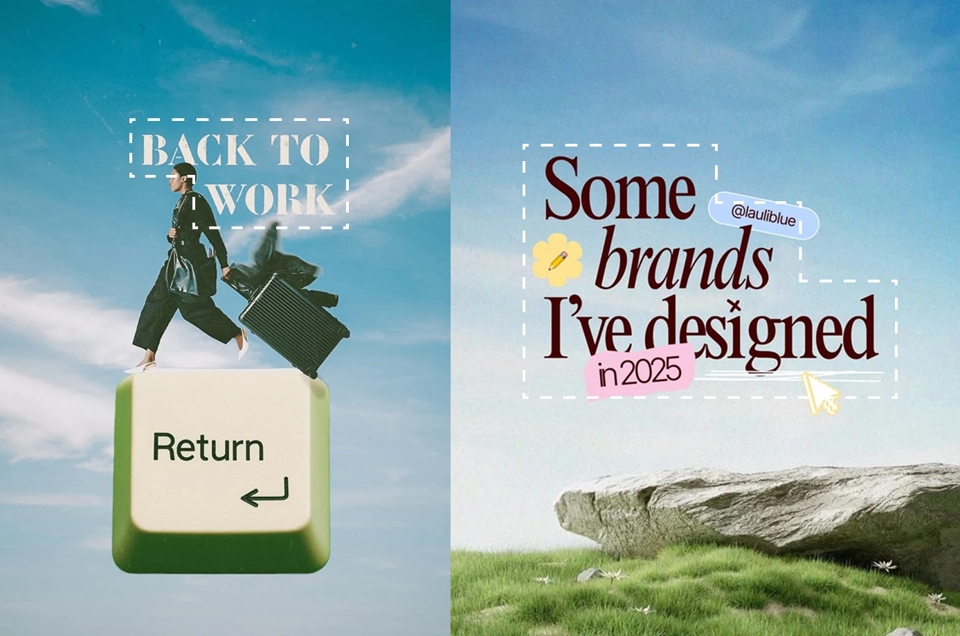
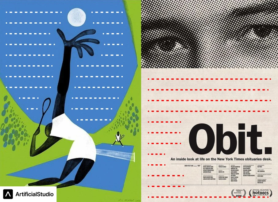
💡 Try to generate shapes with the sections and texts. Instead of leaving a text too long, shorten it to the point where it accompanies the title. Creating shapes with the text will help immensely visually
You can see the shapes the text creates, marked with the dotted white lines:
If you're more experienced, you can even break the grid on purpose, but that decision has its own logic too.
3. The rule of thirds — put the important thing on the crossings 📐
Borrowed from photography, still true in design: divide the space into nine equal parts — three columns, three rows. The temptation is to think the important stuff goes in those rectangles, but the real magic is the four points where the lines cross. Put what matters most on those intersections.
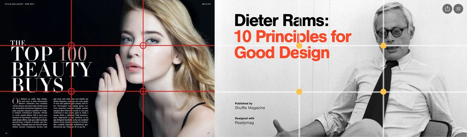
Why does it work? Dead center is predictable, fine, but flat. The eye wants somewhere to land that isn't the obvious middle, and those crossing points are exactly that. That slight "imbalance" creates the visual tension that makes a composition interesting instead of inert.
Subscribe to get deep dives on tech and the future of creative work.
4. Whitespace — the most underrated tool you have 🫙
Whitespace is the area around your main elements, and used well it's one of the most important things.
- It gives the eye somewhere to rest
- It emphasizes what matters
- It keeps everything from feeling cramped.
It doesn't have to be white, by the way. It's just the absence of elements, in any color.
Let it breathe. Let air flow through that website. Don’t be afraid of space.
💡 This is called the Law of Proximity: if everything is grouped together, it will be difficult to understand what is related.
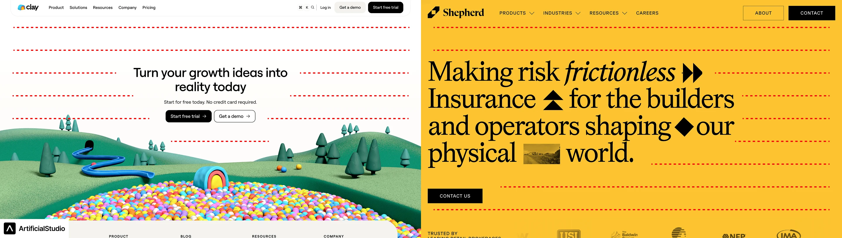
Look at how the best brands do it. An Apple ad has one product, minimal text, and enormous empty space, not because they've run out of things to say, but because they choose not to say them. That restraint is the entire difference between designing and decorating.
The fastest way to get better at it is to study references relentlessly: notice how much the work you admire leaves out.
5. Break the rules — once you've earned it 💥
Everything above is a set of tools, not laws.
💡 Once you actually understand the rules, you can break them on purpose!
A perfectly centered composition can be quietly powerful when it's a choice. A maximalist, packed to the edges layout can be exactly right for a certain energy. Breaking the grid at one deliberate spot can create the tension a piece was missing.
The difference between breaking a rule well and breaking it badly is simply knowing the rule exists and having used it enough to feel where it bends.
6. Intentionality — the thread through all of it 🎯
Notice the word that keeps coming back: on purpose. Hierarchy, grids, thirds, whitespace, none of them are magic on their own. A layout works when you can say why every element is the size it is and where it is. "It felt right" is fine as instinct, but instinct is just a lot of intentional decisions compressed into a reflex over time.
The final and, I think, most important lesson:
7. Don’t force it.
I’m going to tell you a phrase that I think fits very well for this moment:
“Design is like a fart. If you have to force it, it’s probably shit 💩”
If you are doing a design and something doesn’t feel right, step away from it, look at it as a whole, like a work of art. If you feel something doesn’t feel right, take it out. If you feel it’s horrible, start over. If nothing makes sense anymore, let it rest and come back to it later. Don’t force it.
What used to be the bottleneck, with AI is now the easy part. Which means your time and value moves up the stack to the decisions AI can't make: what to include, what to cut, what leads the eye, what gets the whitespace.
That's exactly how we think about Artificial Studio. It's a place to generate as much raw material as your idea needs (images, video, audio, branding assets) so you can spend your energy on composing, not on sourcing.
Generate five versions of a hero image and try each one against your grid. Iterate a layout's elements for the cost of a coffee instead of a photoshoot. The machine proposes; you decide. It turns composition from a skill you rarely have time to exercise into the main thing you get to do all day.
Because in a world where everyone has perfect assets, the person who knows where and how to put them wins. That person is you.
Try it yourself
Start creating with the tools mentioned in this article.